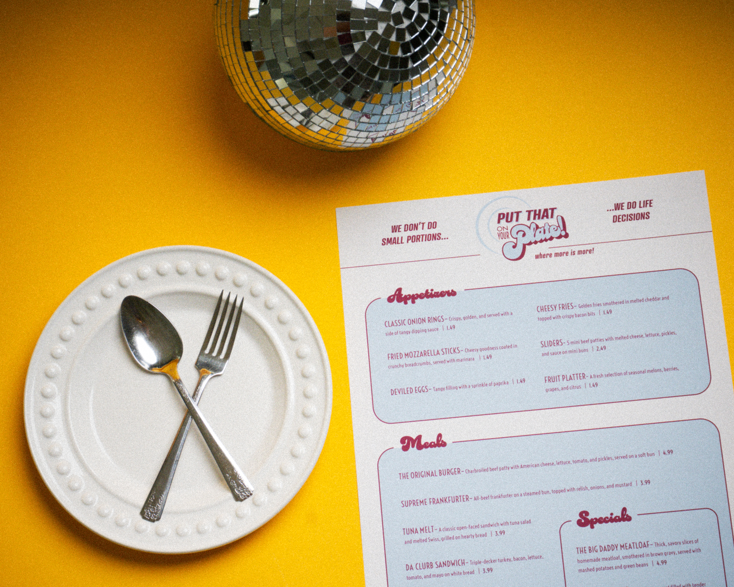
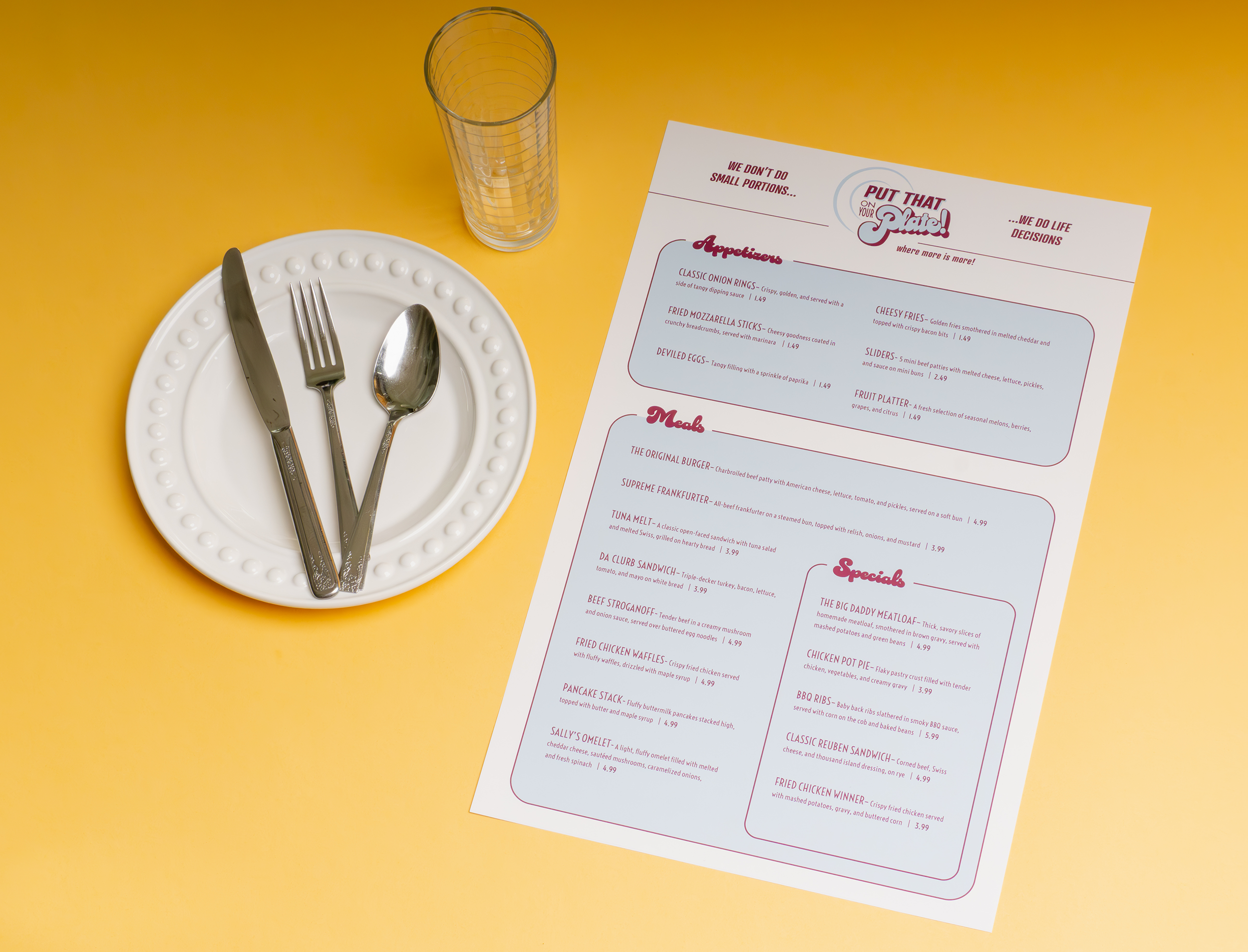
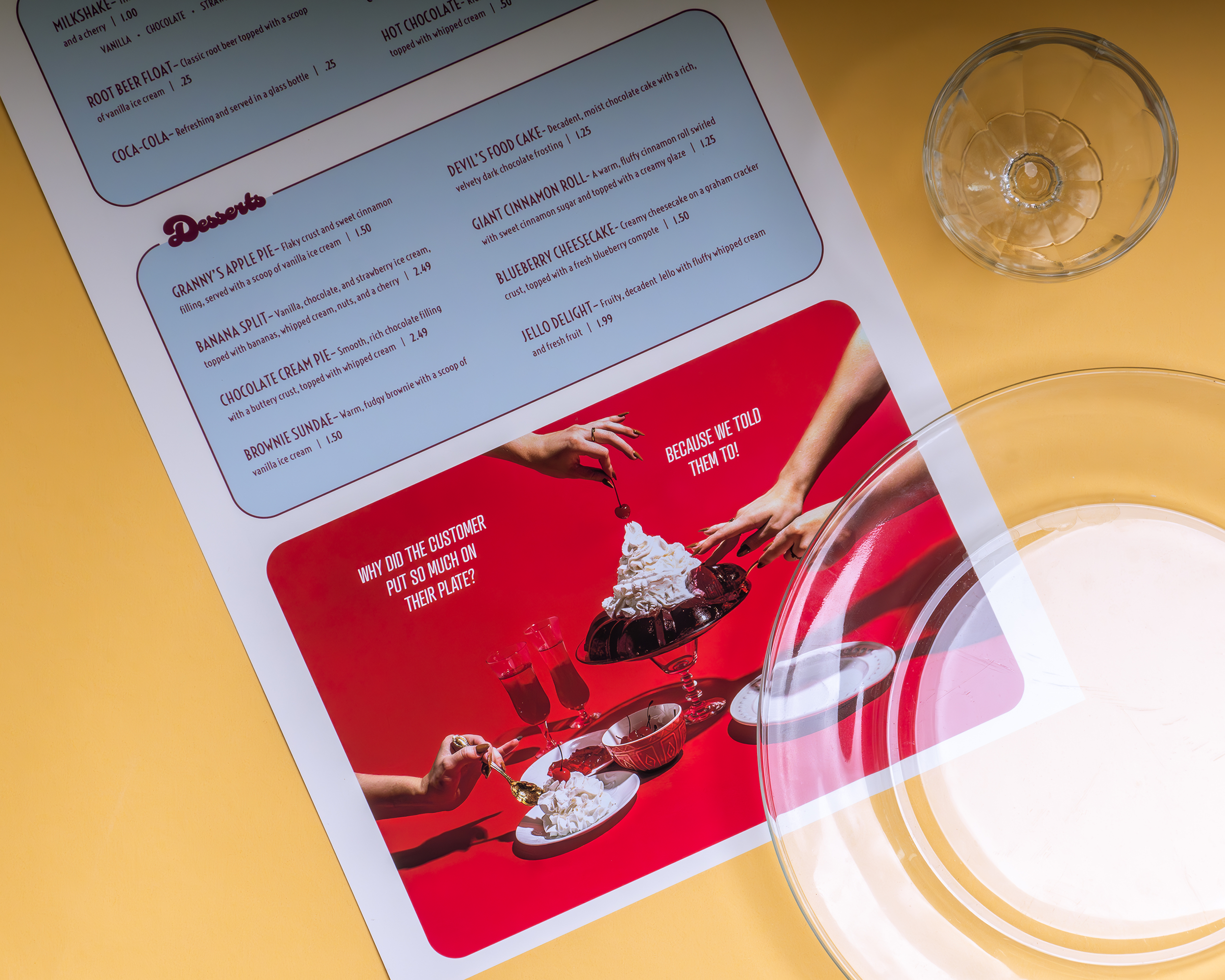
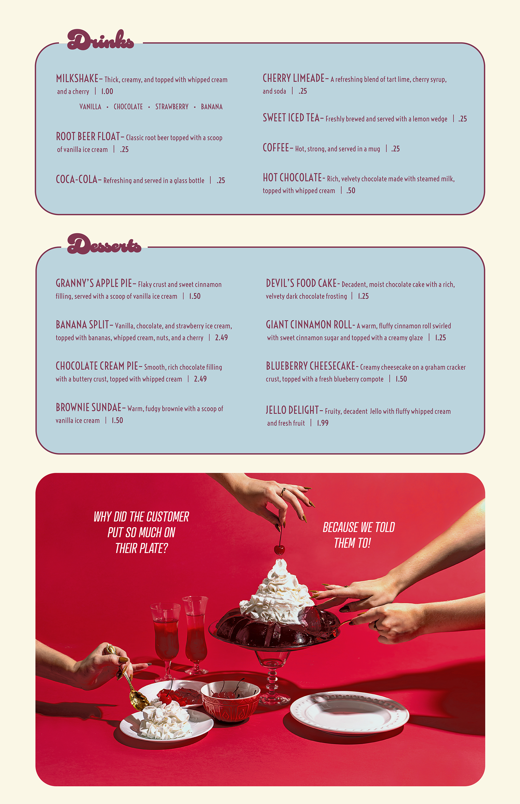
Put That on Your Plate!
restaurant branding
When assigned to come up with my own restaurant brand using only two colors, I chose to create a vintage 60’s diner. I intentionally picked the colors dusky teal and burgundy to reflect the nostalgic feel of the time period. After creating a visual system that included a primary logo, secondary icon, color palette, and full style guide, I chose an assortment of authentic comfort food to display on the menu.